Las sugerencias typeahead.js de Twitter no tienen estilo (no tienen borde, fondo transparente, etc.)

182

Estoy usando twitter typeahead.js 0.9.3 y parece que mis sugerencias no tienen ningún estilo.

Estoy obteniendo esto:

error tipográfico

En lugar de algo como esto: (tomado de la página de ejemplos )

ideal de mecanografía

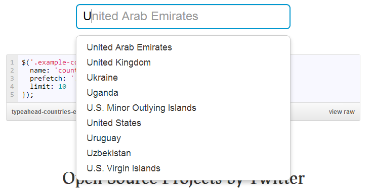
JavaScript habilitando typeahead:

$('.search-typeahead').typeahead({
    name: 'videos',
    remote: {
        url: '/api/v1/internal/videos/typeahead?text=%QUERY'
    }
});

Elemento de entrada HTML:

<input type="text" value="" id="search_keywords" class="no-clear search-typeahead"/>

Notas adicionales:

El sitio en el que estoy trabajando tiene jQuery 1.10.1 y no usa twitter bootstrap. Hay un montón de CSS que no escribí y, por lo tanto, no estoy familiarizado con lo que me temo que está interfiriendo, sin embargo, parece que el complemento agrega sus propios estilos (no hay un archivo .css que lo acompañe), por lo que no debería anular teóricamente las cosas. ? Estoy confundido por qué mis estilos funcionan, pero los agregados por el complemento no lo hacen, lo que resulta en sugerencias con fondos transparentes, sin bordes, etc.

Zugwalt
fuente

Respuestas:

212

Entonces, mirando los documentos que veo ahora:

De manera predeterminada, el menú desplegable creado por typeahead.js se verá feo y querrás diseñarlo para asegurarte de que se ajuste al tema de tu página web.

Por lo tanto, mi solución fue copiar el estilo del ejemplo que deseaba replicar:

.tt-query, /* UPDATE: newer versions use tt-input instead of tt-query */
.tt-hint {
    width: 396px;
    height: 30px;
    padding: 8px 12px;
    font-size: 24px;
    line-height: 30px;
    border: 2px solid #ccc;
    border-radius: 8px;
    outline: none;
}

.tt-query { /* UPDATE: newer versions use tt-input instead of tt-query */
    box-shadow: inset 0 1px 1px rgba(0, 0, 0, 0.075);
}

.tt-hint {
    color: #999;
}

.tt-menu { /* UPDATE: newer versions use tt-menu instead of tt-dropdown-menu */
    width: 422px;
    margin-top: 12px;
    padding: 8px 0;
    background-color: #fff;
    border: 1px solid #ccc;
    border: 1px solid rgba(0, 0, 0, 0.2);
    border-radius: 8px;
    box-shadow: 0 5px 10px rgba(0,0,0,.2);
}

.tt-suggestion {
    padding: 3px 20px;
    font-size: 18px;
    line-height: 24px;
}

.tt-suggestion.tt-is-under-cursor { /* UPDATE: newer versions use .tt-suggestion.tt-cursor */
    color: #fff;
    background-color: #0097cf;

}

.tt-suggestion p {
    margin: 0;
}
Zugwalt
fuente
19
Por alguna razón, mi edición sugerida fue rechazada, pero tenga en cuenta que la tt-is-under-cursorclase parece haber cambiado su nombre tt-cursor. Documentación aquí .
Joe Freeman
66
También hay una en tt-inputlugar de la tt-query(como para 0.10.5)
Filip Spiridonov
77
¿No sería mejor tener las versiones antiguas en los comentarios?
worldsayshi
3
.tt-dropdown-menu ahora es .tt-menu
bkwdesign
1
Agregue cursor: pointer;a .tt-is-under-cursorpara tener un cursor adecuado que le indique al usuario que debe hacer clic.
Laurent W.
124

Por lo tanto, los siguientes estilos le darán esta apariencia. Se basa en el CSS que extraje del sitio web oficial de ejemplos de Typeahead.

ingrese la descripción de la imagen aquí

CSS:

.tt-query {
  -webkit-box-shadow: inset 0 1px 1px rgba(0, 0, 0, 0.075);
     -moz-box-shadow: inset 0 1px 1px rgba(0, 0, 0, 0.075);
          box-shadow: inset 0 1px 1px rgba(0, 0, 0, 0.075);
}

.tt-hint {
  color: #999
}

.tt-menu {    /* used to be tt-dropdown-menu in older versions */
  width: 422px;
  margin-top: 4px;
  padding: 4px 0;
  background-color: #fff;
  border: 1px solid #ccc;
  border: 1px solid rgba(0, 0, 0, 0.2);
  -webkit-border-radius: 4px;
     -moz-border-radius: 4px;
          border-radius: 4px;
  -webkit-box-shadow: 0 5px 10px rgba(0,0,0,.2);
     -moz-box-shadow: 0 5px 10px rgba(0,0,0,.2);
          box-shadow: 0 5px 10px rgba(0,0,0,.2);
}

.tt-suggestion {
  padding: 3px 20px;
  line-height: 24px;
}

.tt-suggestion.tt-cursor,.tt-suggestion:hover {
  color: #fff;
  background-color: #0097cf;

}

.tt-suggestion p {
  margin: 0;
}

Esto supone que su entrada tendrá la form-controlclase. Para mi ejemplo, es así:

<input class="typeahead form-control" type="text" placeholder="States of USA">
André Pena
fuente
44
Funcionó para mí con un ajuste. Aparece .tt-dropdown-menues ahora .tt-menu. Gracias por responder.
groundh0g
33

https://github.com/bassjobsen/typeahead.js-bootstrap-css/blob/master/typeaheadjs.css

Los otros no se veían geniales, este se parece más a Bootstrap.

Eduardo
fuente
1
Funciona muy bien con Bootstrap
Jose Cherian
Esto funcionó perfectamente sin cambios en Rails 4.2 y bootstrap-sass (3.3.7) autoprefixer-rails (> = 5.2.1) sass (> = 3.3.4) También es un poco más amigable que algunas de las otras soluciones. Además, significa que su cuadro de entrada puede tener un ancho del 100%, por lo que debería funcionar con la mayoría de los diseños.
rmcsharry
Aunque si ingresa es más ancho que 162 (el ancho mínimo utilizado aquí), es posible que también desee agregar ancho: 100%; a la primera sección para el menú tt / tt-dropdown
rmcsharry
19

Typeahead ha cambiado algunos de sus nombres de clase y los ejemplos anteriores ahora son incorrectos.

Por ejemplo:

  • En lugar de .tt-suggestion.tt-is-under-cursor usar.tt-suggestion:hover
  • En lugar de .tt-dropdown-menu, el uso.tt-menu

Si desea tomar prestado el estilo de la página de ejemplos , puede ver su hoja de estilo aquí :

.typeahead,
.tt-query,
.tt-hint {
  width: 396px;
  height: 30px;
  padding: 8px 12px;
  font-size: 24px;
  line-height: 30px;
  border: 2px solid #ccc;
  -webkit-border-radius: 8px;
     -moz-border-radius: 8px;
          border-radius: 8px;
  outline: none;
}

.typeahead {
  background-color: #fff;
}

.typeahead:focus {
  border: 2px solid #0097cf;
}

.tt-query {
  -webkit-box-shadow: inset 0 1px 1px rgba(0, 0, 0, 0.075);
     -moz-box-shadow: inset 0 1px 1px rgba(0, 0, 0, 0.075);
          box-shadow: inset 0 1px 1px rgba(0, 0, 0, 0.075);
}

.tt-hint {
  color: #999
}

.tt-menu {
  width: 422px;
  margin: 12px 0;
  padding: 8px 0;
  background-color: #fff;
  border: 1px solid #ccc;
  border: 1px solid rgba(0, 0, 0, 0.2);
  -webkit-border-radius: 8px;
     -moz-border-radius: 8px;
          border-radius: 8px;
  -webkit-box-shadow: 0 5px 10px rgba(0,0,0,.2);
     -moz-box-shadow: 0 5px 10px rgba(0,0,0,.2);
          box-shadow: 0 5px 10px rgba(0,0,0,.2);
}

.tt-suggestion {
  padding: 3px 20px;
  font-size: 18px;
  line-height: 24px;
}

.tt-suggestion:hover {
  cursor: pointer;
  color: #fff;
  background-color: #0097cf;
}

.tt-suggestion.tt-cursor {
  color: #fff;
  background-color: #0097cf;

}

.tt-suggestion p {
  margin: 0;
}

Aquí hay una demostración en fragmentos de pila

KyleMit
fuente
2
¿Es posible evitar que la escritura anticipada haga que el ancho sea tan pequeño?
Rune Jeppesen
13

Este es el código que me funciona:

.twitter-typeahead .tt-query,
.twitter-typeahead .tt-hint {
    margin-bottom: 0;
}
.tt-hint {
    display: block;
    width: 100%;
    padding: 8px 12px;
    font-size: 14px;
    line-height: 1.428571429;
    color: #999;
    vertical-align: middle;
    background-color: #ffffff;
    border: 1px solid #cccccc;
    border-radius: 4px;
    -webkit-box-shadow: inset 0 1px 1px rgba(0, 0, 0, 0.075);
          box-shadow: inset 0 1px 1px rgba(0, 0, 0, 0.075);
    -webkit-transition: border-color ease-in-out 0.15s, box-shadow ease-in-out 0.15s;
          transition: border-color ease-in-out 0.15s, box-shadow ease-in-out 0.15s;
}
.tt-dropdown-menu {
    min-width: 160px;
    margin-top: 2px;
    padding: 5px 0;
    background-color: #ffffff;
    border: 1px solid #cccccc;
    border: 1px solid rgba(0, 0, 0, 0.15);
    border-radius: 4px;
    -webkit-box-shadow: 0 6px 12px rgba(0, 0, 0, 0.175);
          box-shadow: 0 6px 12px rgba(0, 0, 0, 0.175);
    background-clip: padding-box;

}
.tt-suggestion {
    display: block;
    padding: 3px 20px;
}
.tt-suggestion.tt-is-under-cursor {
    color: #fff;
    background-color: #dfdfdf;
}
.tt-suggestion.tt-is-under-cursor a {
    color: #fff;
}
.tt-suggestion p {
    margin: 0;
}
André Pena
fuente
1
Esta solución funciona sin importar el ancho de la entrada. ¡Gracias!
spacesuitdiver
El trabajo perfecto para mí con typeahead.js + BS3 + datatable en la misma pantalla. Gracias
Mike Castro Demaria
3

Como tengo un entorno menos con BS3 incluido, tomé el código css de Zugwalt (lo coloqué en una jerarquía más legible) y lo llené de estilo desde el menú desplegable de bs3. Simplemente sigue sus variables (personalizadas).

    .twitter-typeahead {
      display: block;
      width: 100%; //BS 3 needs this to inherit this for children

      .tt-query,
      .tt-hint {
        margin-bottom: 0;
      }

      .tt-dropdown-menu {
        z-index: @zindex-dropdown;
        min-width: 326px;
        padding: 5px 0;
        margin: 2px 0 0; // override default ul
        font-size: @font-size-base;
        text-align: left; // Ensures proper alignment if parent has it changed (e.g., modal footer)
        background-color: @dropdown-bg;
        border: 1px solid @dropdown-fallback-border; // IE8 fallback
        border: 1px solid @dropdown-border;
        border-radius: @border-radius-base;
        .box-shadow(0 6px 12px rgba(0, 0, 0, .175));
        background-clip: padding-box;

        .tt-suggestions {

          .tt-suggestion {
            padding: 3px 12px;
            font-weight: normal;
            line-height: @line-height-base;
            color: @dropdown-link-color;
            white-space: nowrap; // prevent links from randomly breaking onto new lines
          }

          .tt-suggestion.tt-cursor {
            color: @dropdown-link-hover-color;
            background-color: @dropdown-link-hover-bg;
          }

          .tt-suggestion p {
            margin: 0;
          }
        }
      }
    }
Paul Bormans
fuente
1

Aquí hay una scssversión que se basa en las variables / declaraciones bootstrap tanto como sea posible. Lamentablemente, no puede extender los selectores anidados en sass, de lo contrario sería más pequeño:

@mixin typeahead-active() {
  // mimics  @extend .dropdown-menu > .active > a;
  color: $dropdown-link-active-color;
  text-decoration: none;
  outline: 0;
  background-color: $dropdown-link-active-bg;
}

//https://github.com/corejavascript/typeahead.js/blob/master/doc/jquery_typeahead.md#class-names
span.twitter-typeahead {

  // this is the suggested matches dropdown
  .tt-menu {
    @extend .dropdown-menu;
  }

  .tt-hint {
    color: #999
  }

  // Added to suggestion elements.
  .tt-suggestion {

    // mimic .dropdown-menu > li > a
    padding: 3px 20px;
    line-height: $line-height-base;

    // Added to suggestion element when menu cursor moves to said suggestion.
    &.tt-cursor {
      @include typeahead-active;
    }

    // Hover/focus on suggestion
    &:hover,
    &:focus {
      @include typeahead-active;
    }

    p {
      margin: 0;
    }
  }

  .input-group & {
    display: block !important;
    .tt-dropdown-menu {
      top: 32px !important;
    }
  }
  .input-group.input-group-lg & {
    .tt-dropdown-menu {
      top: 44px !important;
    }
  }
  .input-group.input-group-sm & {
    .tt-dropdown-menu {
      top: 28px !important;
    }
  }
}
kross
fuente
1

Si está utilizando Bootstrap 4, es suficiente para hacer esto:

span.twitter-typeahead
  width: 100%

.tt-input
  box-shadow: inset 0 1px 1px rgba(0, 0, 0, 0.075)

.tt-menu
  @extend .list-group
  box-shadow: 0 5px 10px rgba(0,0,0,.2)
  width: 100%

.tt-suggestion
  @extend .list-group-item

.tt-selectable
  @extend .list-group-item-action
Archonic
fuente
0

En mi caso particular, el posicionamiento absoluto lo resolvió. El posicionamiento relativo estaba empujando hacia abajo otros elementos de arranque cuando la lista de sugerencias (tt-menu) estaba abierta.

.tt-menu { 
    z-index: 2147483647;
    position: absolute;    
}

Puede agregar esto a la respuesta anterior https://stackoverflow.com/a/26934329/1225421

Alex Pandrea
fuente