Estoy tratando de recrear esta imagen con CSS:
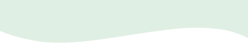
No lo necesitaría para repetir. Esto es lo que comencé, pero solo tiene una línea recta:
#wave {
  position: absolute;
  height: 70px;
  width: 600px;
  background: #e0efe3;
}<div id="wave"></div>
css
css-shapes
Stevenspiel
fuente
fuente
Respuestas:
No estoy seguro de que sea tu forma, pero está cerca, puedes jugar con los valores:
https://jsfiddle.net/7fjSc/9/
#wave { position: relative; height: 70px; width: 600px; background: #e0efe3; } #wave:before { content: ""; display: block; position: absolute; border-radius: 100% 50%; width: 340px; height: 80px; background-color: white; right: -5px; top: 40px; } #wave:after { content: ""; display: block; position: absolute; border-radius: 100% 50%; width: 300px; height: 70px; background-color: #e0efe3; left: 0; top: 27px; }<div id="wave"></div>fuente
Creo que esta es la forma correcta de hacer la forma que quieras. Utilizando las posibilidades de SVG y un contenedor para mantener la forma receptiva.
svg { display: inline-block; position: absolute; top: 0; left: 0; } .container { display: inline-block; position: relative; width: 100%; padding-bottom: 100%; vertical-align: middle; overflow: hidden; }<div class="container"> <svg viewBox="0 0 500 500" preserveAspectRatio="xMinYMin meet"> <path d="M0,100 C150,200 350,0 500,100 L500,00 L0,0 Z" style="stroke: none; fill:red;"></path> </svg> </div>fuente
Mi implementación usa el elemento svg en html y también hice un generador para hacer la ola que desea:
https://smooth.ie/blogs/news/svg-wavey-transitions-between-sections
<div style="height: 150px; overflow: hidden;">
  <svg viewBox="0 0 500 150" preserveAspectRatio="none" style="height: 100%; width: 100%;">
    <path d="M0.00,92.27 C216.83,192.92 304.30,8.39 500.00,109.03 L500.00,0.00 L0.00,0.00 Z" style="stroke: none;fill: #e1efe3;"></path>
  </svg>
</div>
https://jsfiddle.net/1b8L7nax/5/
fuente
Mi implementación de CSS pura basada en arriba con 100% de ancho. ¡Espero eso ayude!
Mostrar fragmento de código
#wave-container { width: 100%; height: 100px; overflow: hidden; } #wave { display: block; position: relative; height: 40px; background: black; } #wave:before { content: ""; display: block; position: absolute; border-radius: 100%; width: 100%; height: 300px; background-color: white; right: -25%; top: 20px } #wave:after { content: ""; display: block; position: absolute; border-radius: 100%; width: 100%; height: 300px; background-color: black; left: -25%; top: -240px; }<div id="wave-container"> <div id="wave"> </div> </div>fuente
Me gusta la respuesta de ThomasA, pero quería un contexto más realista con la onda que se usa para separar dos divs. Así que creé una demostración más completa donde el separador SVG se posiciona perfectamente entre los dos divs.
Ahora pensé que sería genial ir más allá. ¿Y si pudiéramos hacer todo esto en CSS sin la necesidad del SVG en línea? ? El punto es evitar el marcado adicional. Así es como lo hice:
Dos simples
<div>:/** CSS using pseudo-elements: **/ #A { background: #0074D9; } #B { background: #7FDBFF; } #A::after { content: ""; position: relative; left: -3rem; /* padding * -1 */ top: calc( 3rem - 4rem / 2); /* padding - height/2 */ float: left; display: block; height: 4rem; width: 100vw; background: hsla(0, 0%, 100%, 0.5); background-image: url("data:image/svg+xml,%3Csvg xmlns='http://www.w3.org/2000/svg' viewBox='0 70 500 60' preserveAspectRatio='none'%3E%3Crect x='0' y='0' width='500' height='500' style='stroke: none; fill: %237FDBFF;' /%3E%3Cpath d='M0,100 C150,200 350,0 500,100 L500,00 L0,0 Z' style='stroke: none; fill: %230074D9;'%3E%3C/path%3E%3C/svg%3E"); background-size: 100% 100%; } /** Cosmetics **/ * { margin: 0; } #A, #B { padding: 3rem; } div { font-family: monospace; font-size: 1.2rem; line-height: 1.2; } #A { color: white; }<div id="A">Lorem ipsum dolor sit amet, consectetur adipiscing elit. Vivamus nec quam tincidunt, iaculis mi non, hendrerit felis. Nulla pretium lectus et arcu tempus, quis luctus ex imperdiet. In facilisis nulla suscipit ornare finibus. … </div> <div id="B" class="wavy">… In iaculis fermentum lacus vel porttitor. Vestibulum congue elementum neque eget feugiat. Donec suscipit diam ligula, aliquam consequat tellus sagittis porttitor. Sed sodales leo nisl, ut consequat est ornare eleifend. Cras et semper mi, in porta nunc.</div>Divisor ondulado de demostración (con pseudoelementos CSS para evitar marcas adicionales)
Fue un poco más complicado de posicionar que con un SVG en línea, pero funciona igual de bien. (Podría usar propiedades personalizadas de CSS o variables de preprocesador para mantener la altura y el relleno fáciles de leer).
Para editar los colores, debe editar el SVG codificado en URL.
Preste atención (como en la primera demostración) a un cambio en el
viewBoxpara deshacerse de los espacios no deseados en el SVG. (Otra opción sería dibujar un SVG diferente).Otra cosa a la que hay que prestar atención aquí es la
background-sizeconfiguración para100% 100%que se estire en ambas direcciones.fuente
Recientemente, se introdujo una herramienta increíble llamada Get Waves en la que simplemente desde la interfaz de usuario puede crear sus propias ondas y luego exportarlas a formato SVG. Esto es tan simple como ir a https://getwaves.io/ sitio web y disfrutarlo!
Editar:
Recientemente descubrí también una nueva herramienta: https://shapedivider.app/
fuente
Aquí hay otro forma de hacerlo :) El concepto es crear un polígono de ruta de recorte con la onda como un lado.
Este enfoque es bastante flexible. Puede cambiar la posición (izquierda, derecha, arriba o abajo) en la que aparece la onda, cambiar la función de onda a cualquier función (t) que corresponda a [0,1]). El polígono también se puede usar para formas externas, lo que permite que el texto fluya alrededor de la onda cuando está en orientación 'izquierda' o 'derecha'.
Al final, puede descomentar un ejemplo que demuestra la animación de la ola.
function PolyCalc(f /*a function(t)  from [0, infinity) => [0, 1]*/,
                  s, /*a slice function(y, i) from y [0,1] => [0, 1], with slice index, i, in [0, n]*/
									w /*window size in seconds*/,
                  n /*sample size*/,
                  o /*orientation => left/right/top/bottom - the 'flat edge' of the polygon*/
                  )
{
	this.polyStart = "polygon(";
  this.polyLeft = this.polyStart + "0% 0%, "; //starts in the top left corner
  this.polyRight = this.polyStart + "100% 0%, "; //starts in the top right corner
  this.polyTop = this.polyStart + "0% 0%, "; // starts in the top left corner
  this.polyBottom = this.polyStart + "0% 100%, ";//starts in the bottom left corner

  var self = this;
  self.mapFunc = s;
  this.func = f;
  this.window = w;
  this.count = n;
  var dt = w/n;

  switch(o) {
    case "top":
      this.poly = this.polyTop; break;
    case "bottom":
      this.poly = this.polyBottom; break;
  	case "right":
    	this.poly = this.polyRight; break;
  	case "left":
  	default:
  		this.poly = this.polyLeft; break;
    }

  this.CalcPolygon = function(t) {
  	var p = this.poly;
    for (i = 0; i < this.count; i++) {
      x = 100 * i/(this.count-1.0);
      y = this.func(t + i*dt);
      if (typeof self.mapFunc !== 'undefined')
      	y=self.mapFunc(y, i);
      y*=100;
      switch(o) {
        case "top":
          p += x + "% " + y + "%, "; break;
        case "bottom":
          p += x + "% " + (100-y) + "%, "; break;
      	case "right":
        	p += (100-y) + "% " + x + "%, "; break;
      	case "left":
        default:
        	p += y + "% " + x + "%, "; break;
      }
    }

    switch(o) {
      case "top":
        p += "100% 0%)"; break;
      case "bottom":
        p += "100% 100%)";
        break;
    	case "right":
      	p += "100% 100%)"; break;
    	case "left":
      default:
      	p += "0% 100%)"; break;
    }

    return p;
  }
};

var text = document.querySelector("#text");
var divs = document.querySelectorAll(".wave");
var freq=2*Math.PI; //angular frequency in radians/sec
var windowWidth = 1; //the time domain window which determines the range from [t, t+windowWidth] that will be evaluated to create the polygon
var sampleSize = 60;
divs.forEach(function(wave) {
  var loc = wave.classList[1];

  var polyCalc = new PolyCalc(
	  function(t) { //The time domain wave function
  	  return (Math.sin(freq * t) + 1)/2; //sine is [-1, -1], so we remap to [0,1]
    },
    function(y, i) { //slice function, takes the time domain result and the slice index and returns a new value in [0, 1]
      return MapRange(y, 0.0, 1.0, 0.65, 1.0);  //Here we adjust the range of the wave to 'flatten' it out a bit.  We don't use the index in this case, since it is irrelevant
    },
    windowWidth, //1 second, which with an angular frequency of 2pi rads/sec will produce one full period.
    sampleSize, //the number of samples to make, the larger the number, the smoother the curve, but the more pionts in the final polygon
    loc //the location
  );

    var polyText = polyCalc.CalcPolygon(0);
    wave.style.clipPath = polyText;
    wave.style.shapeOutside = polyText;
    wave.addEventListener("click",function(e) {document.querySelector("#polygon").innerText = polyText;});
  });

function MapRange(value, min, max, newMin, newMax) {
  return value * (newMax - newMin)/(max-min) + newMin;
}

//Animation - animate the wave by uncommenting this section
//Also demonstrates a slice function which uses the index of the slice to alter the output for a dampening effect.
/*
var t = 0;
var speed = 1/180;

var polyTop = document.querySelector(".top");

var polyTopCalc = new PolyCalc(
	  function(t) {
  	  return (Math.sin(freq * t) + 1)/2;
    },
    function(y, i) {
      return MapRange(y, 0.0, 1.0, (sampleSize-i)/sampleSize, 1.0);
    },
    windowWidth, sampleSize, "top"
  );

function animate() {
		var polyT = polyTopCalc.CalcPolygon(t);
    t+= speed;
    polyTop.style.clipPath = polyT;
    requestAnimationFrame(animate);
}

requestAnimationFrame(animate);
*/
div div { padding:10px; /*overflow:scroll;*/ } .left { height:100%; width:35%; float:left; } .right { height:200px; width:35%; float:right; } .top { width:100%; height: 200px; } .bottom { width:100%; height:200px; } .green { background:linear-gradient(to bottom, #b4ddb4 0%,#83c783 17%,#52b152 33%,#008a00 67%,#005700 83%,#002400 100%); } .mainContainer { width:100%; float:left; } #polygon { padding-left:20px; margin-left:20px; width:100%; }<div class="mainContainer"> <div class="wave top green"> Click to see the polygon CSS </div> <!--div class="wave left green"> </div--> <!--div class="wave right green"> </div--> <!--div class="wave bottom green"></div--> </div> <div id="polygon"></div>fuente